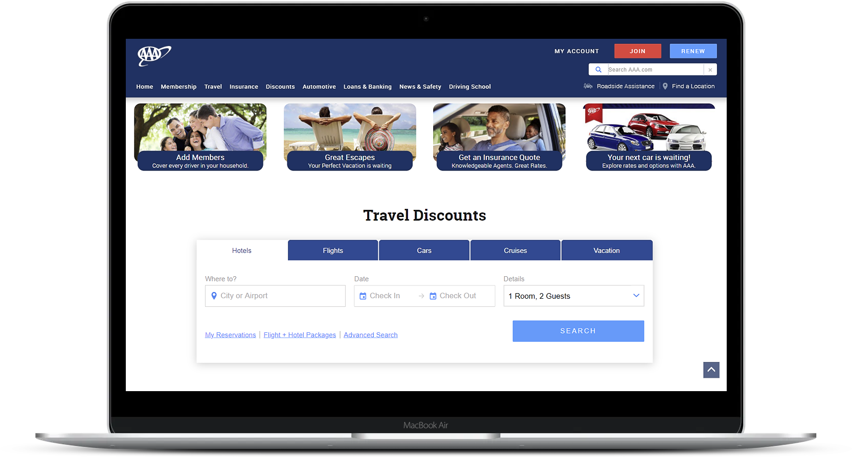
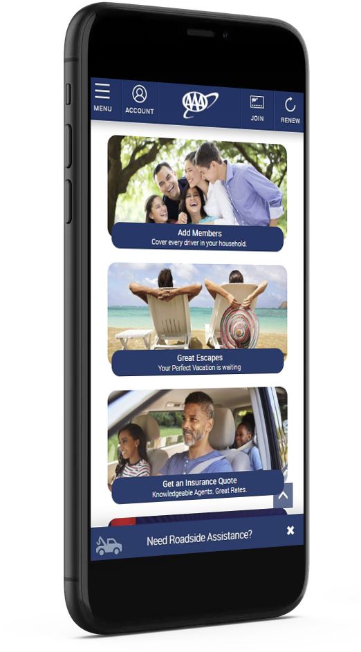
The offer row component on the AAA Northeast homepage features products for Membership, Travel, Insurance, and Finance. I wanted to run some A/B tests using Adobe Target to see if we can improve the overall experience of this component for our users.
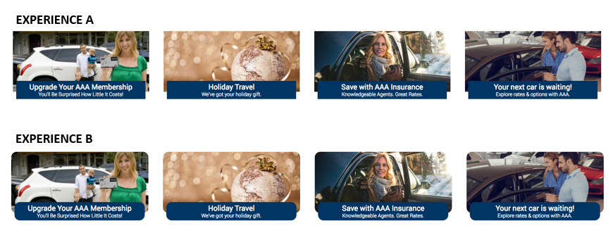
After reading an article at UXPlanet.org called Rounded or Sharp-Corner Buttons?, I was inspired to run an A/B Test that focuses on the corners of the offer row images and offer row text blue backgrounds. This article, along with other online articles, have stated that rounded corners are easier on the eyes and perform a better usability. I also utilized our data in Adobe Analytics to understand the percentage of visitors who were visiting the homepage but were not engaging/clicking on any of the promotional boxes in the offer row.
To test the hypothesis that users would click on the promotional boxes in the offer row if they had rounded corners, I changed border radius to the offer row images and offer row text backgrounds on all four promo boxes for Experience B. To achieve this, I used CSS code in Adobe Target changing the border radius property.
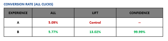
Increase engagement/clicks in the offer row component on the AAA Northeast homepage.
The rounded corners had a positive impact and resulted in a higher click-through rate. This iterative design change has since been permanently added to the offer row component on the AAA Northeast homepage.