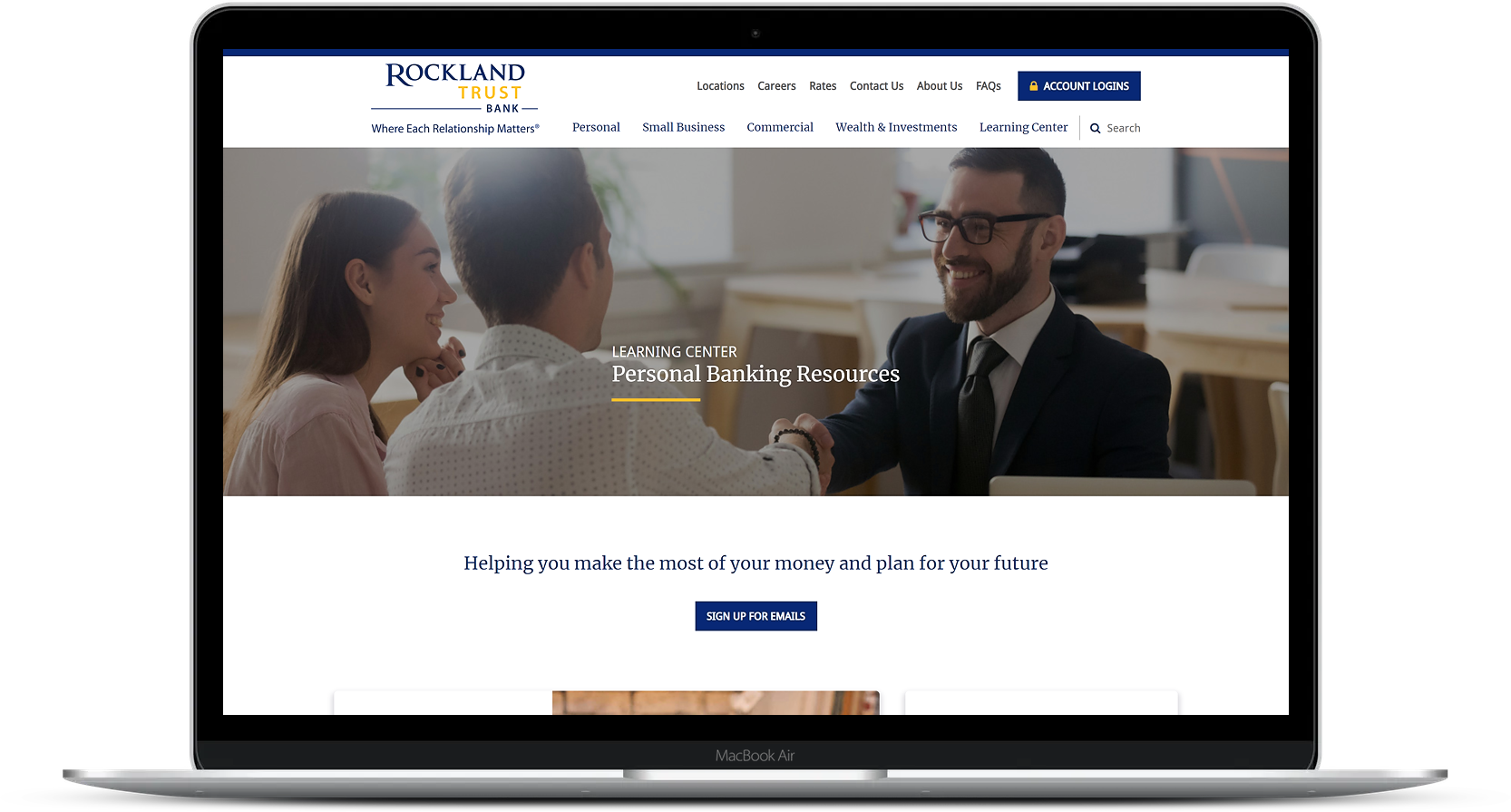
The Learning Center section on the Rockland Trust website features web pages for Personal Resources and Business Resources. Through user research and data analysis, I learned that the pages views for each resource page year over year were low. We also leveraged heat mapping and event tracking to learn that visitor engagement for both pages were underperforming across all device types. After discussions with the digital marketing team, it was decided that we would aim for a redesign of these Learning Center pages, with the goal of increasing page views and engagement.
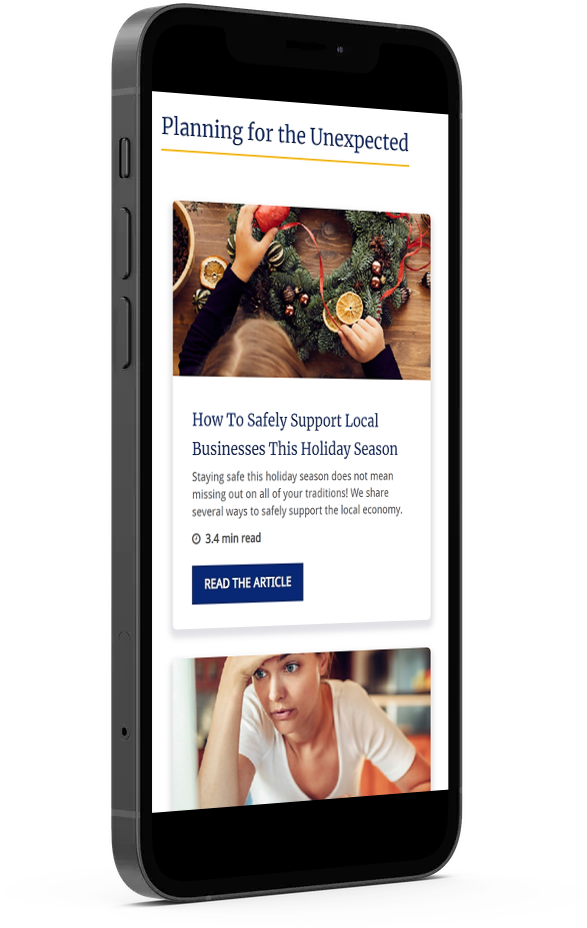
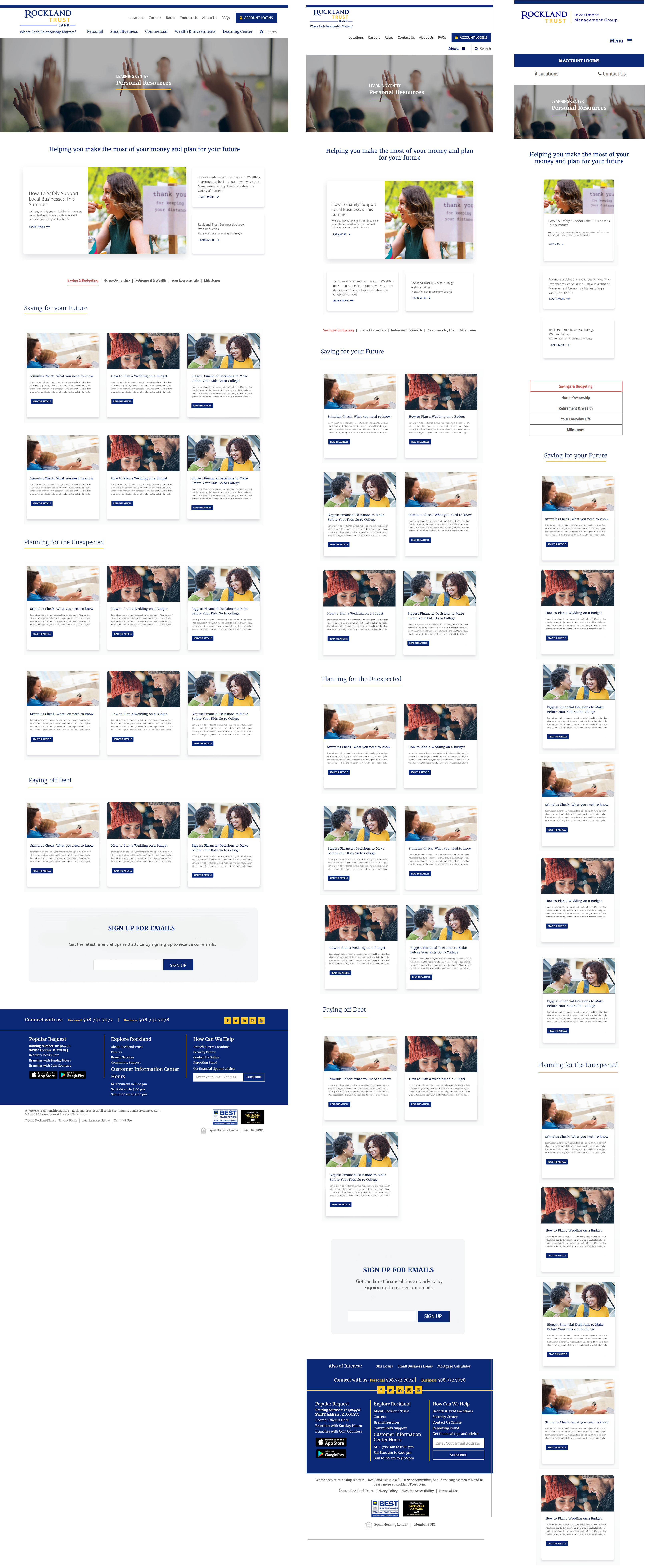
Throughout the design and discovery process, I created variations of high-fidelity wireframes that were presented to the digital marketing team. These wireframes focused on a modern and clean design, while making the content easy to navigate. One major design improvement was the usage of UI cards. The new design of the UI cards made it possible to add short teaser descriptions for each article, with the goal of making visitors more compelled to click through to the article page.
I spearheaded this project during all phases of delivery from discovery, design, development, pre-launch and launch. I worked closely with Jack Henry's backend developers and project managers to monitor and test the functionality of the page template in our UAT environment. We also worked together to review the designs to make sure they were meeting ADA compliance standards. Once the template was deployed to our Banno CMS production environment, I handled all of the front-end development and cross browser testing before the offical launch.
After about three months, the Rockland Trust Bank website now features user-friendly Learning Center pages for Personal Resources and Business Resources.