Developed responsive tables, with minor design iterations, that render well across all device types, resulting in a better, cleaner user experience.
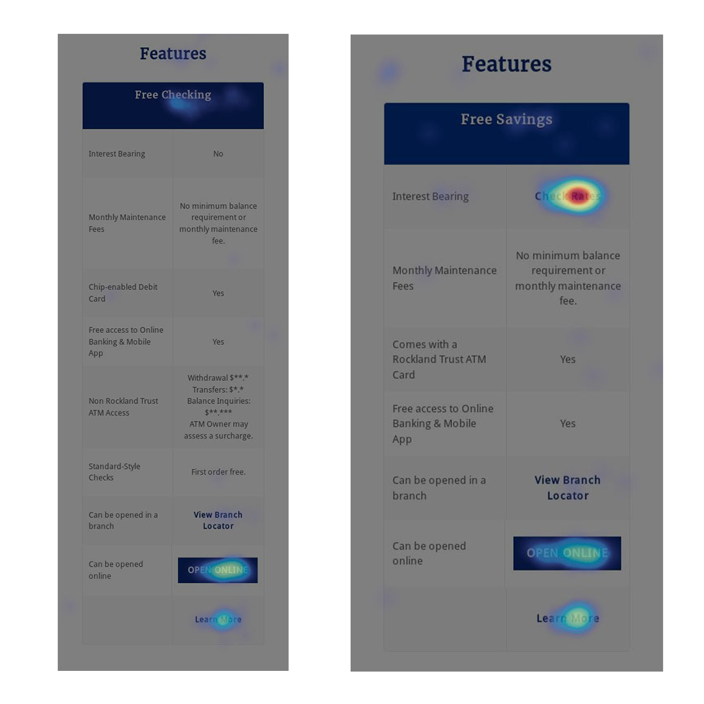
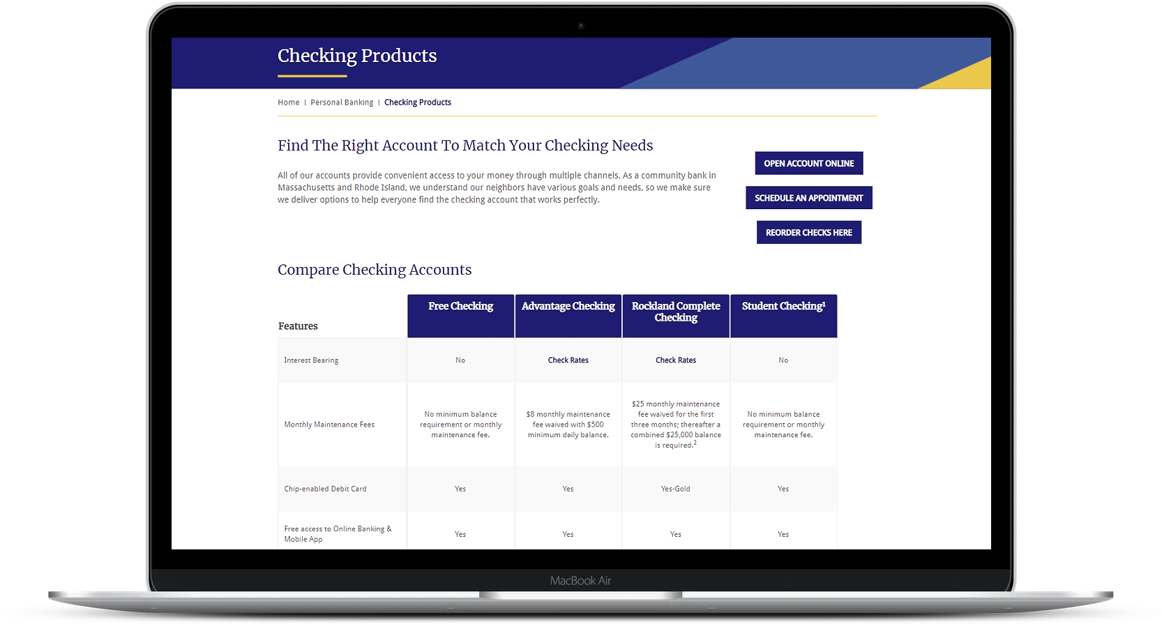
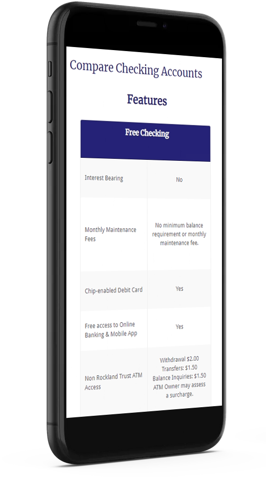
While reviewing data in Google Analytics, I learned that while both product pages receive a high volume of traffic, the click-though-rates for the CTA links and buttons featured in the tables were underperforming. Our data also showed only a low percentage of visitors were reaching the Account Openings page from these product pages, specifically on mobile devices. The HTML tables were not responsive, and horizontal scrolling was required, making it difficult to view large amounts of content on mobile devices.
I decided to develop new responsive tables that would collapse the table rows into separate cards, resulting in a mobile-friendly user experience. The content in the tables is now easier to read when scrolling vertically through the page.
Also, too many CTA buttons were competing with each other, all expressing the same level of importance. Research has shown that people are less likely to take action when they’re presented with too many choices. In order to draw more attention to "Open Online" CTA buttons, I changed the rest of the buttons into text links.
Since the launch of these responsive tables, we have seen a significant increase in engagement across all platforms. Our heatmap data has shown us that large volume of users are clicking on the "Open Online" CTA buttons on mobile devices.